 PT
PTCASE STUDY 02 • NEOFIN
✦ 8 min read
A simpler way to understand product usage
Company
Neofin
Period
2025–2026
Role
Senior Product Designer · Product Development
Team
Product, Engineering and Growth
OVERVIEW • 00
I built an internal product that turns Google Analytics events into accessible views of feature adoption, communication performance and account activity.
CHALLENGE • 01
The problem
Neofin began instrumenting events in key features such as agreements, the customer portal, campaigns and consolidated invoice delivery, as well as banners and calls to action for product communication and upsell. The data reached Google Analytics, but finding events, reconstructing journeys and interpreting behavior required knowledge of the tool. The challenge was to make these insights accessible to people making product decisions.
RESEARCH • 02
I structured and reviewed the event taxonomy, recording requests, starts, completions and entry points for each flow.
I benchmarked product analytics platforms to see how they turned events into funnels, charts, alerts and actionable segments.
I mapped Product and Growth questions about feature adoption, communication performance and behavior by company.
DEFINITION • 03
Focus and direction
The initial hypothesis was to connect an interface to Google Analytics, organize the events already in place and turn them into understandable dashboards without requiring everyone to operate the analytics tool. The first version prioritized feature adoption and communication performance. Health Score, real-time events, AI and alerts expanded the view as the product evolved.
APPROACH • 04
How I worked
The problem and available events were already clear. I started from the first version's needs, researched references and built a working product to test the idea. I used my development background and AI assistance to put it into use and refine it with real data.
Before building dashboards, we needed a consistent language for events. Each journey recorded who requested a feature, who started and completed its flow, and which entry point brought them there. This foundation supported conversion, abandonment and adoption by company without reconstructing behavior manually.
DATA FOUNDATION / EVENT TAXONOMY • 05
FEATURES • 06
Feature adoption and funnels
Requests, starts, completions, abandonment rate, active users, companies, entry points, usage projections and customer-level detail.
Banner and CTA performance
Views and clicks can be compared to assess interest, placement and performance of product communications and upsell calls to action.
Health Score by company
Usage is classified as healthy, needing attention or at risk of churn based on frequency and breadth of feature use over time.
Real-time events
Teams can see what each company is doing now and search a history of all captured events for deeper investigation.
Insights, alerts and shareable dashboards
AI-generated insights, period filters, drop and improvement detection, saved dashboards and links that preserve the exact shared view.
SELECTED SCREENS • 07
From events to product decisions
Screens and recordings show how adoption, communications and account health become easier to explore.
Platform access
A direct, restricted entry to the internal environment, connected to the corporate account used by Neofin teams.
Feature adoption
Teams can follow usage volume, conversion, abandonment, companies and entry points for each feature.
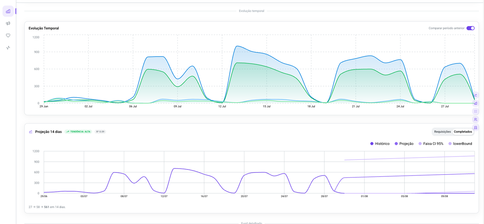
Trends and projections
Historical behavior can be compared across periods and projected over the next 14 days to support trend reading and planning.
Communication performance
Views, clicks, CTR and reach by user and company show whether each message generated interest and action.
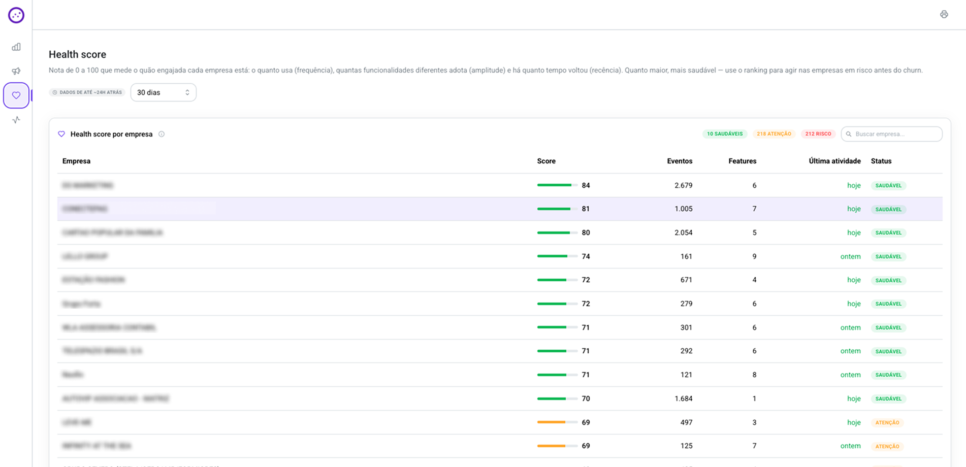
Health Score
Frequency, breadth and recency of usage form a company health ranking that helps reveal accounts needing attention or at risk of churn.
Activity feed
Real-time tracking shows flows started and completed, alongside a searchable history for more detailed investigation.
TESTING • 08
How we validated
We tested a working version connected to real events. Adjustments came from questions the dashboards still could not answer: which features people used, how communications performed and which companies needed attention.
RESULTS • 09
Event and funnel analysis without relying on complex Google Analytics navigation
A combined view of feature adoption, communication performance and company health
A shared foundation for investigating drops, identifying opportunities and discussing the same filtered view
LEARNINGS • 10
Organizing events made the analyses possible. Building a working version early helped test the idea with the team and reveal what the dashboards lacked. Combining it with Hotjar behavioral data remained a next step.
NEXT PROJECT