 PT
PTCASE STUDY 08 • BRANDLOVRS
✦ 7 min read
A new foundation for the brand platform
Company
BrandLovrs
Period
2022–2025
Role
Senior Product Designer
Team
Product, Engineering, Sales and Operations
OVERVIEW • 00
I reorganized the platform where brands tracked campaigns, sales and results, using the visual language developed for the BrandLovrs app.
CHALLENGE • 01
The problem
The first version of the platform had accumulated new requirements, and its structure was making further evolution difficult. Registration needed revision, information was hard to consult and the visual language had drifted away from the native app.
RESEARCH • 02
We audited existing flows and the user experience to find the MVP's critical friction points.
We interviewed Sales, Operations and brand customers to understand expectations and information needs.
We reviewed market references and compared strengths, limitations and opportunities relevant to the product.
DEFINITION • 03
Focus and direction
We wanted to simplify brand registration and access to campaign and sales information. We also needed to bring the platform closer to the app's identity and organize pages so the product could accommodate new features.
APPROACH • 04
How I worked
I led the project with support from the product lead for brands. We organized a short sequence of research, synthesis, ideation and prototyping. After validating the flow, wireframes structured the main pages and high-fidelity design reused the visual language developed for the native app.
We started with the existing product, reviewing flows and documenting difficulties to decide how to reorganize registration, campaigns and results analysis.
JOURNEY, HYPOTHESES AND PAGE STRUCTURE • 05
FEATURES • 06
Brand registration
Fewer steps and better organization of the information needed to bring a new brand into operation.
Campaign management
Flows with more context for setting up, tracking and reviewing creator initiatives.
Sales indicators
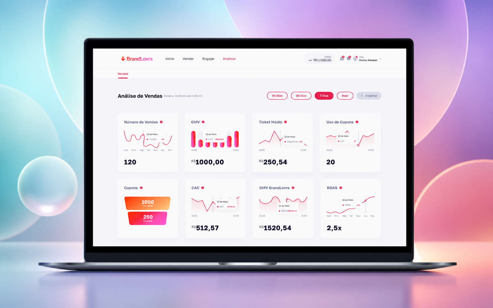
Sales, GMV, average order value, coupons and acquisition views organized to support decisions.
Shared visual foundation
Shared colors, components and patterns brought the web platform closer to the app and reduced inconsistencies.
SELECTED SCREENS • 07
A clearer platform for operations and analysis
The material shows the transition from evaluating the MVP to wireframes and final interfaces aligned with the brand ecosystem.
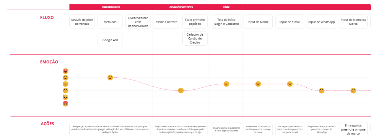
Brand journey
The map brought operational stages together and highlighted where the MVP created the most effort.
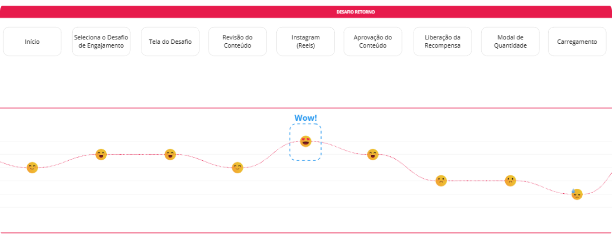
Experience map
The analysis connected actions, available information and the needs of people involved in operations.
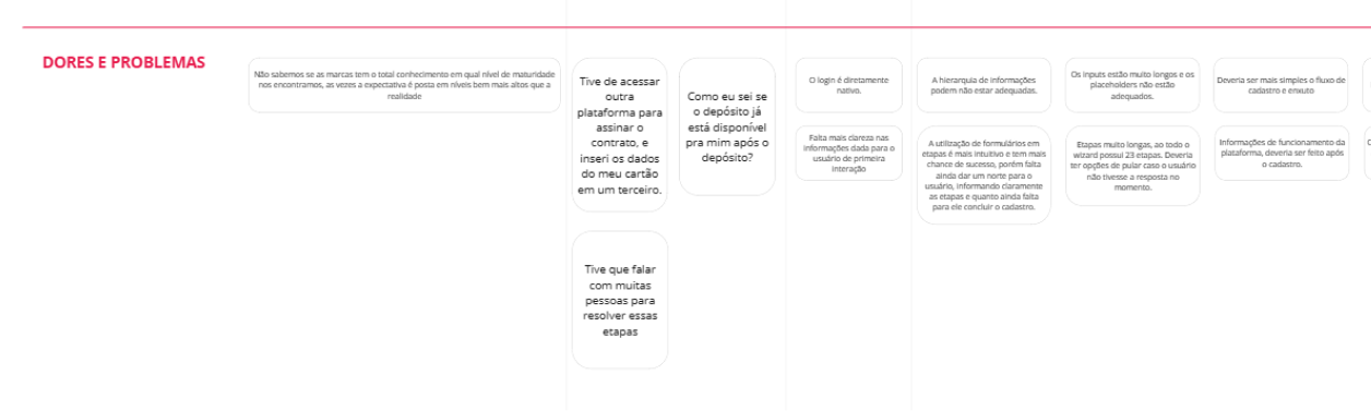
Evolution hypotheses
Opportunities prioritized visual consistency, shorter registration and denser useful information.
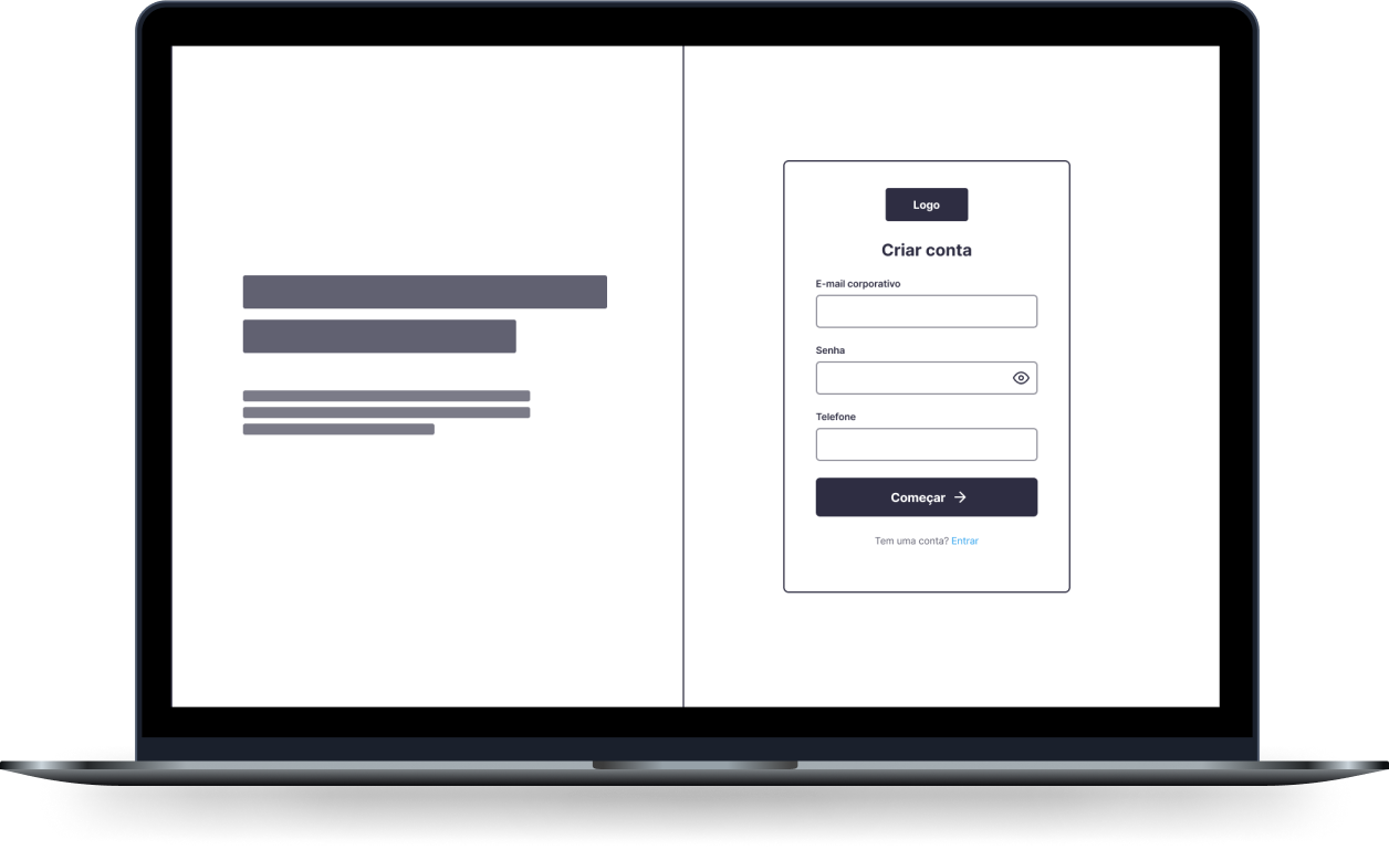
Page structure
Wireframes tested hierarchy, navigation and information distribution before visual design.

Overview
The home page organizes context, actions and indicators relevant to operations.
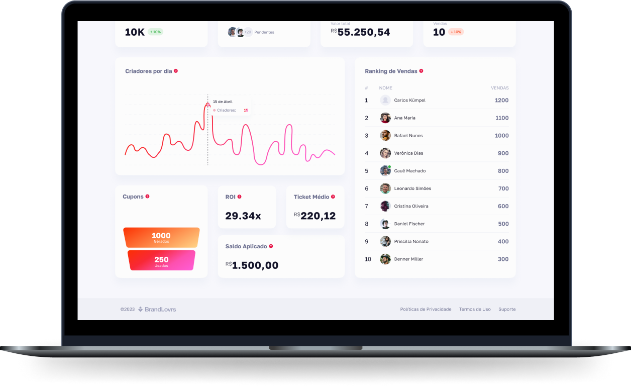
Campaigns
Campaign management gains a clearer structure for creation and tracking.
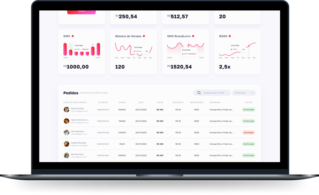
Results analysis
Sales and acquisition indicators become easier to compare and act on.
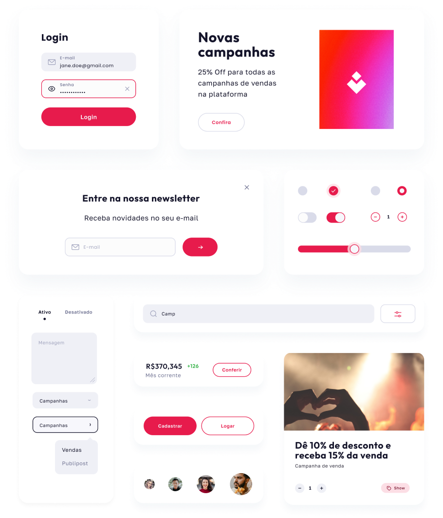
Consistency across products
A shared visual foundation connects the app and platform while respecting the needs of each context.
TESTING • 08
How we validated
Product and project stakeholders reviewed flows and wireframes. We continued to follow the transition from the MVP as brands and internal teams contributed to new features.
RESULTS • 09
A more consistent foundation for the brand platform's evolution
Better visual alignment between BrandLovrs web and app products
Early reports of improved performance and increased interest in the new proposal
LEARNINGS • 10
Reviewing the existing product helped distinguish immediate corrections from structural changes. The shared identity connected the products while the revised registration and information architecture addressed brands' difficulties.
NEXT PROJECT