 PT
PTCASE STUDY 07 • BRANDLOVRS
✦ 7 min read
From a web MVP to a native app for creators
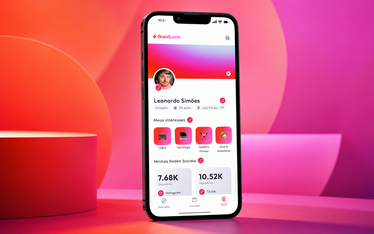
Company
BrandLovrs
Period
2022–2025
Role
Senior Product Designer
Team
Product, Engineering and Operations
OVERVIEW • 00
The move from BrandLovrs' first web product to an iOS and Android app with simpler onboarding and clearer paths to discover and follow campaigns.
CHALLENGE • 01
The problem
BrandLovrs was growing, and its first web version had validated the proposition. The next step was an app closer to creators' routines, with faster access to campaigns and communication. We had to make the move to iOS and Android on a short timeline.
RESEARCH • 02
We audited the MVP's flows, navigation and friction points along the creator journey.
We mapped the journey and emotional states to identify questions, expectations and opportunities in the core path.
We ran activities with project stakeholders and reviewed market products to challenge assumptions during a short discovery phase.
DEFINITION • 03
Focus and direction
We prioritized a less tiring registration flow, clear explanations of social account connections and language that felt natural to creators. We also revised internal terminology and explained why each piece of information was requested during onboarding.
APPROACH • 04
How I worked
Product and Design worked through a two-week immersion to synthesize the context, organize the main flow and align decisions before prototyping. Given the deadline, wireframes focused on critical screens. High-fidelity design used a component foundation adapted to the app's new identity.
We reviewed the existing product journey to locate questions and difficulties. These points informed early screen sketches and the decisions we needed to test before detailing the interface.
JOURNEY, EMOTIONAL MAP AND WIREFRAMES • 05
FEATURES • 06
More direct onboarding
Fewer steps and a better information sequence made the first visit lighter and easier to understand.
Social account connection
Social sign-in and explanations of the value of each network connection turned a technical requirement into a clearer benefit.
Campaign discovery
Navigation with a stronger community feel helped creators find opportunities and join campaigns.
Profile and tracking
Profile details, interests, reach and performance were brought together in a more useful creator view.
SELECTED SCREENS • 07
From discovery to a native experience
The selection connects the artifacts that guided decisions to the app's final interfaces.
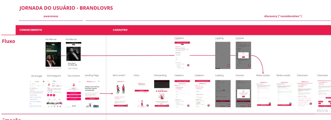
Creator journey
The existing flow was reorganized to show stages, needs and touchpoints before defining the app.
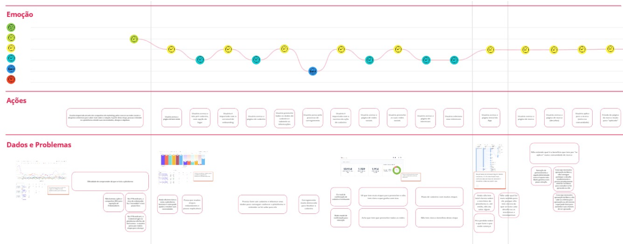
Emotional map
Emotional states revealed moments of doubt and fatigue, especially during registration and setup.
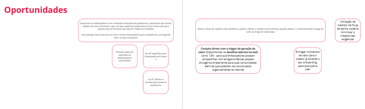
Prioritized opportunities
Evidence became hypotheses about language, onboarding, social connection and campaign discovery.
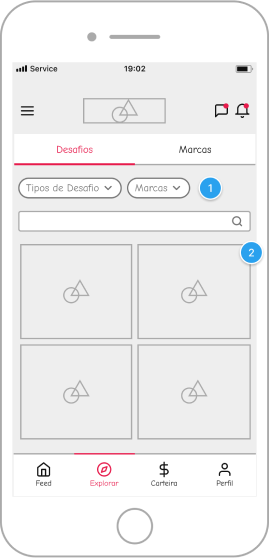
Onboarding structure
Wireframes focused effort on the central decisions in the primary path.
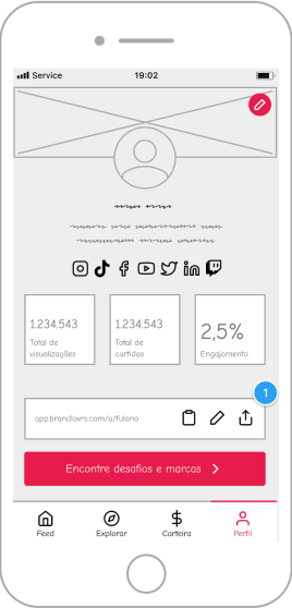
Campaign flow
The structure organizes context, expected action and tracking without overcrowding the screen.
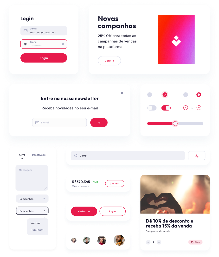
Visual product foundation
Colors, typography and components brought consistency to the app and sped up prototyping.
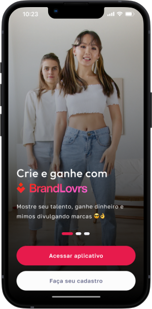
First visit
The final interface presents a more guided entry connected to the brand's visual identity.
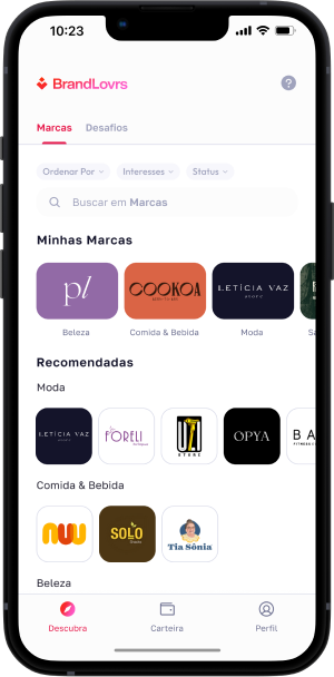
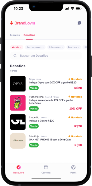
Discovery
Campaigns and opportunities gain hierarchy to support exploration and decisions.
Creator profile
Interests, networks and indicators come together in a clearer personal view.
TESTING • 08
How we validated
Product and project stakeholders reviewed the flow and wireframes before high-fidelity design. After launch, documented feedback described an experience that felt more intuitive, dynamic and visually appealing. The original material also suggested increased participation in campaigns and redemptions.
RESULTS • 09
Launch of BrandLovrs' first native app for iOS and Android
An experience closer to creators' routines and language
The original material reports six times more visits; this figure still needs verification
LEARNINGS • 10
With two weeks to set the project's direction, reviewing the existing journey helped us choose where to focus. Sketches of key screens enabled discussion of the riskiest decisions before detailing the app.
NEXT PROJECT