 PT
PTVISUAL GALLERY 04 • NEOFIN
✦ 3 min read
Shared components for Neofin products
Company
Neofin
Period
2025–2026
Role
Senior Product Designer
Team
Design and Engineering
OVERVIEW • 00
A Figma library of components and interaction patterns, documented and aligned with the components Engineering used in the product.
CHALLENGE • 01
The problem
As product flows grew, interface differences accumulated. We needed components and behaviors that could be reused across the platform.
RESEARCH • 02
Interface inventory
Component audit
Mapping of inconsistencies
DEFINITION • 03
Focus and direction
We prioritized the most-used components while weighing product impact and implementation effort.
APPROACH • 04
How I worked
We worked to keep the Figma library and components in code aligned as the product evolved.
Figma components, interaction rules and coded counterparts were reviewed together as the product evolved.
DESIGN AND CODE IN SYNC • 05
FEATURES • 06
Foundations
Color, typography, spacing and shape form a common visual language.
Components
Reusable components support frequent product tasks and states.
Interaction patterns
Documented behavior helps teams apply components consistently.
SELECTED SCREENS • 07
From foundations to product use
See how color, components and states come together in Neofin forms and flows.
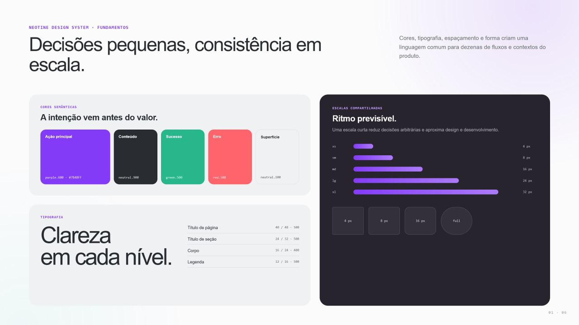
Shared foundations
Color, typography, spacing and shape create a common language for different platform flows and contexts.
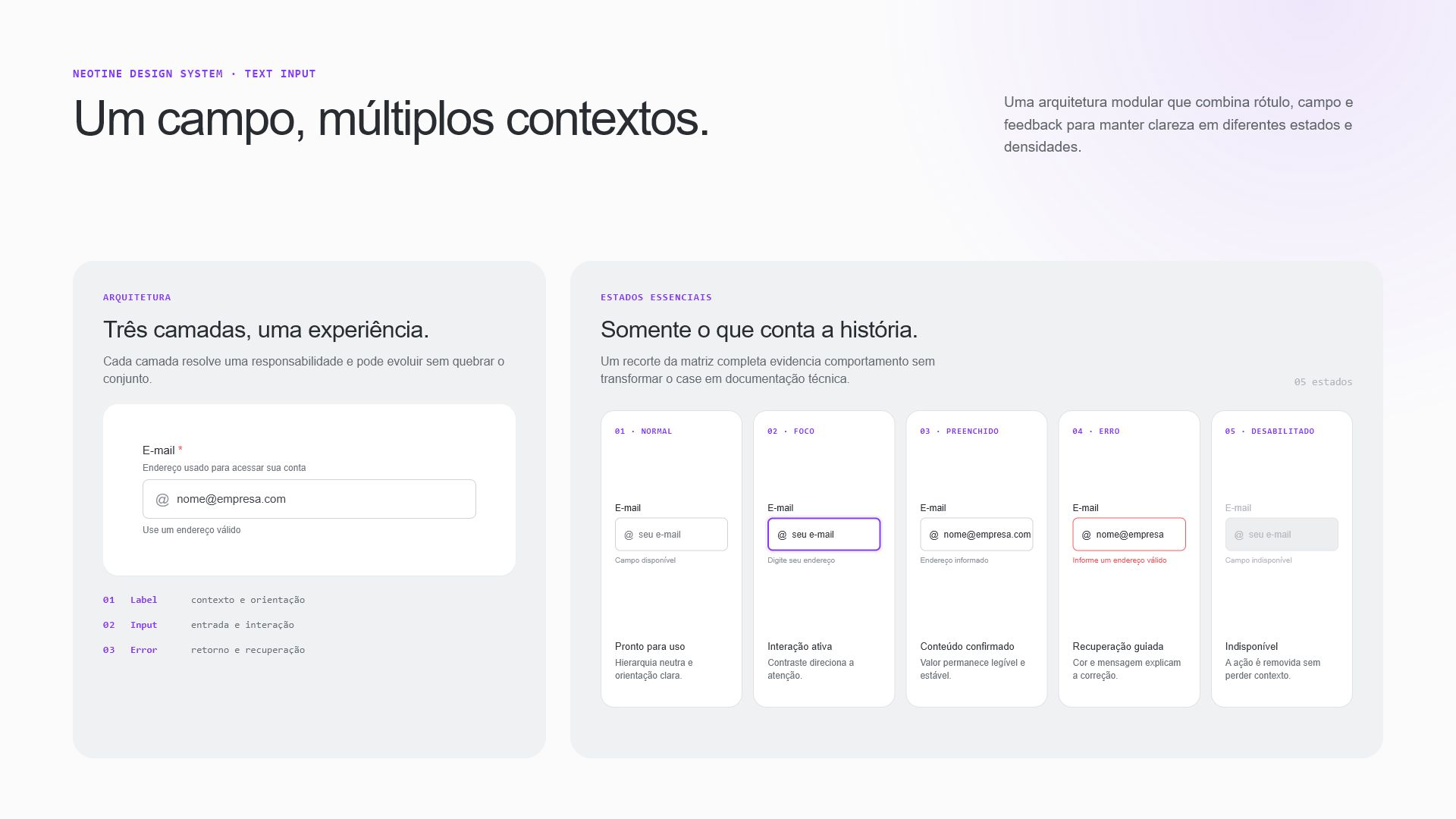
Text Input anatomy
The field combines label, input area and error message. Each part helps people understand what to enter and how to correct a problem.
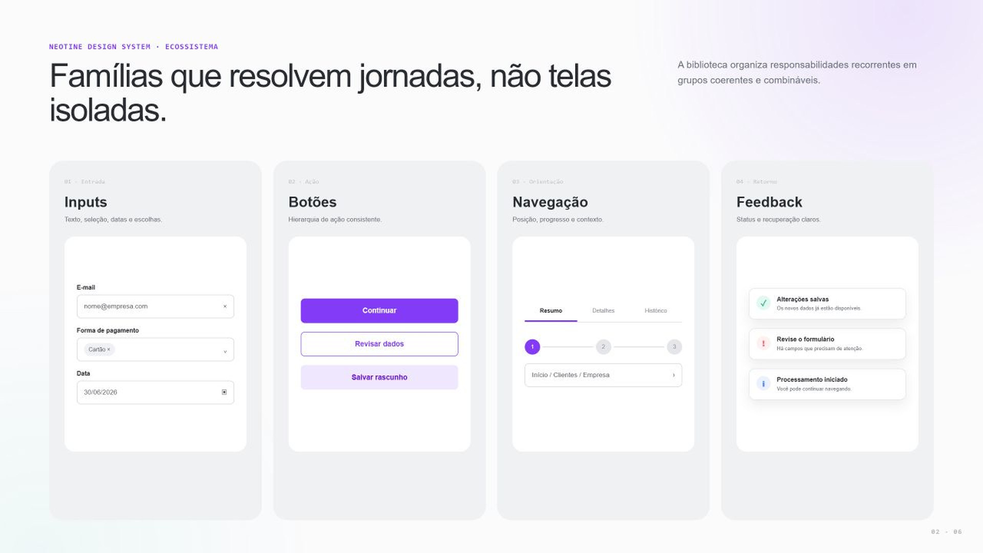
A component ecosystem
Components are grouped by use, including data entry, actions and navigation, to make the right piece easier to choose.
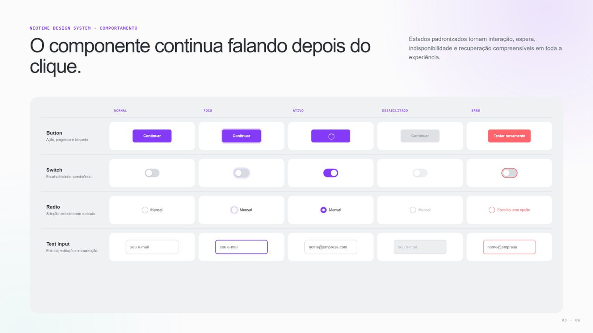
States and behavior
States show when an action is available, in progress or needs correction.
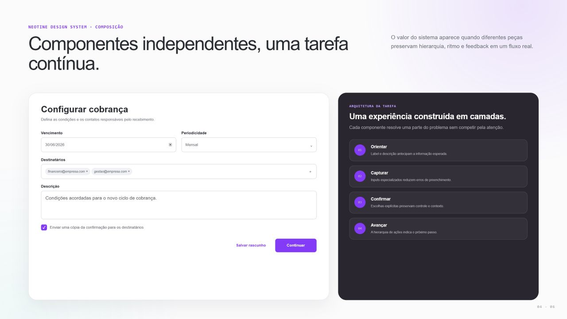
Components working together
A form combines fields, selections and actions with instructions and messages that help people complete it.
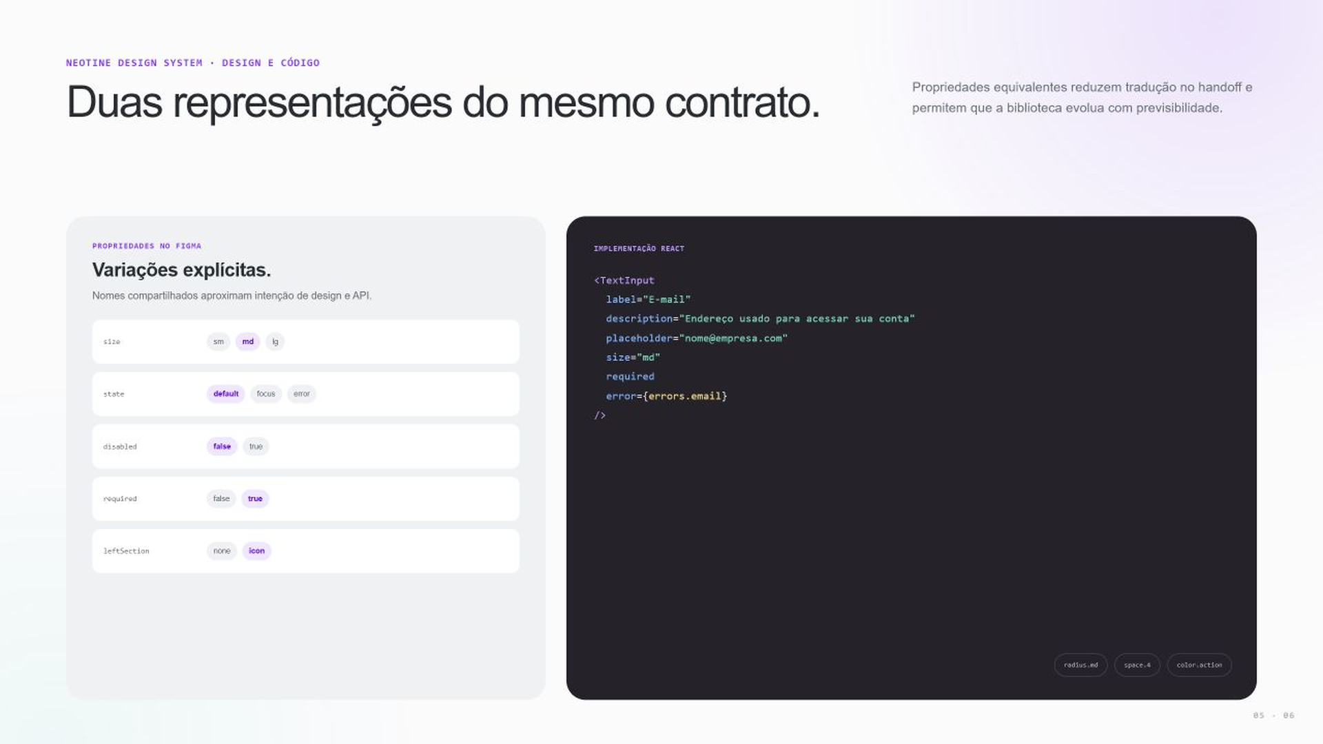
Design connected to code
Equivalent properties and tokens reduce translation during handoff and bring the visual library closer to the API Engineering uses.
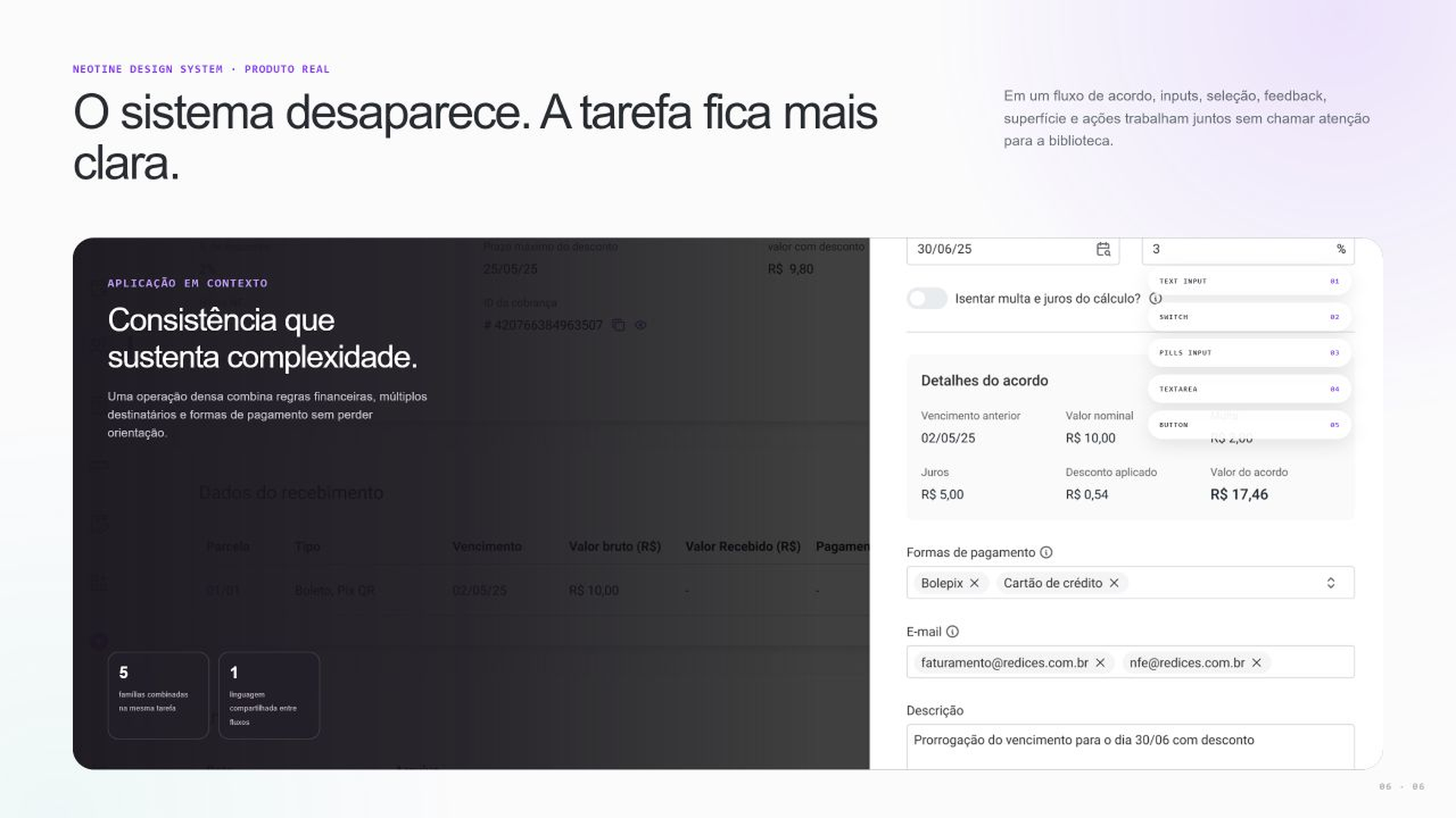
Applied in the product
In the agreement flow, components help people enter terms and check amounts before confirmation.
TESTING • 08
How we validated
We reviewed components as they were used in product features.
RESULTS • 09
More consistency
Clearer developer handoff
Faster decisions
LEARNINGS • 10
The library needs to evolve with the product. Reviews with Engineering help keep Figma close to what people actually use.
NEXT PROJECT